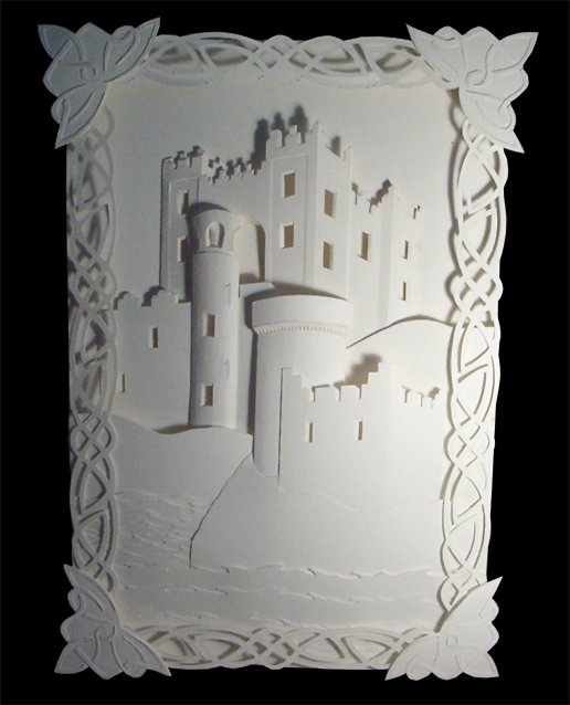
this is a paper sculpture i did for a 2d-3d design class i had at college... it was supposed to be a promotional design for a tourist area and it had to include three peices of architecture from that area (our teacher was a cracked out old lady who made it really hard to design stuff because of how much she wanted in each peice)... so i chose ireland cause i thought it would be easy to do castles... i was wrong.. anyway i had fun with the project... gimme your thoughts
It looks beautiful. From the flat castle walls to the curved towers and the open air [no glass] windows, the shaping of this scene is lovely and the 3 dimensional quality adds much to this one color piece. The celtic knot-work frames it well with a fitting medieval setting and its lace like quality [having "windows"] not only makes it more of an incorporated border and less a separate element of a more "detached" frame but creates interesting shadows.
Only... I found the corner designs a little too "flat," especially when the rest of the border has a "looser" design casting shadows onto the scene behind. I might have suggested to either "push up" the design of the corner triangles a little more [make an identical layer, cut it in the same manner as the rest of the border and lay it on top of the original triangle] or make a similar triangle design but with thicker "strands" for the celtic knot-work and cutting it out in a similar manner to the rest of the border, showing the base paper through the "windows."
And on a smaller note I think the change in the density of the wave lines seems too high in the back or too low in the front. Perhaps another layer line in between the first and second wave that covers the closer shore? It's not that noticeable though.
I especially love the little detailing of the inside edges of the windows, the "dots" lining the underside of the frontmost "tower edge" and the top part of the second cylindrical tower.
--
We're all just varying degrees of weird. "Normal" people just haven't figured that out yet... or won't admit it.
wow... that comment was more thorough than what my teacher said when i handed it in... as for the corners... they were actually added last to cover up some mistakes and they aren't even celtic... shhh and they had to be flat because we had a 3/4 inch guidlline for the project... but not so i sound like i'm making excuses i probably would have done it this way regardless... just cause after so many hours of doing this i got lazy... i was actually gonna do rock textures on the castles but never got around to it... i see what you mean about the waves though.. i never actually noticed it until now... they're all actual castles in ireland... which with a little hope and effort i may actually get to see.... anyway i really appreciate the comment and the fave i was just at your page and i love so much of you're work i wanna fav it all... but i'll have to weave through and find one or two of the best ones in my eyes and fav those ones anyway thanx again
"More thorough than what [your] teacher said." Well, it's all relative and I don't know how thorough your teacher was, but that sounded like a nice way to say I was long-winded *snicker*
Rock textures... sounds ambitious. How would you have done that? Just curious.
I hope you get to see them, and you're welcome for the comment.
Thanks for stopping by my gallery by the way.
--
We're all just varying degrees of weird. "Normal" people just haven't figured that out yet... or won't admit it.
haha i didn't mean you were being long-winded i enjoyed the constructive critism.. and had my teacher been a little more thorough it would have just helped me become a better designer... if anything i was trying to compliment you
as for the rock textures i was going to use paper cut out in the shape of rock combined with some superglue and paper shavings or dust for texture... and it was going to be placed in only a few spots on each castle not the whole thing... i did a rough version on scrap paper and it looked awesome but i didn't have time for the final... i pulled an all nighter to get this done on time and even then i was cutting it close
*laugh* Don't worry, I didn't really think you were insulting me -- usually, for insults I've had thrown at me at least, they're a lot less subtle and a great deal more rude.
Thank you for the compliment.
It sounds great, do you still have the rough version around?
All nighter, eh? Overly ambitious or procrastinator?
--
We're all just varying degrees of weird. "Normal" people just haven't figured that out yet... or won't admit it.
) i was a little ambitious as well as a little procrastinatory (is that a word?)
as for the rough scrap of paper with the texture it is gone to the graveyard with all it's preliminary friends... but if you're interested in the technique it's fairly easy.... just cut out some oblong shapes or whatever... emboss them a bit then take some very fine gritsandpaper and some heavy paper or cardstock and sand it down at the edge then spread a little superglue on the paper or in the crevices (if you are making a tiled effect) and sprinkle the paperdust on the glue... voila textured paper... i dunno you asked cause you wanted to know or if you just wanted to see it but in any case there ya go P
shiny nah... theres superglue all over the final... maybe different types of superglue dry different though... in any case when you sprinkle the paperdust on it'll get rid of the shine.... i think
DeviantART and the martial arts action film, Ninja Assassin, have teamed up to allow ALL deviants the ability to install Journal Skins! Select an awesome Ninja Assassin skin or choose the skin of your choice.
Daily Literature Deviations is a group that is dedicated to bringing literature to the forefront of the deviantArt community. We attempt to accomplish this by daily featuring Literature artists from around the community that deserve the recognition, but are not getting it.
Each day we will feature 5 deviations from the Literature categories in a News Article. In order to support the artists that we feature, we ask that you the news article as well as check out the individual pieces. We understand that each day you may not be able to check out each and every one of the pieces, everyone has their own things going on. We just ask that you make an attempt to help support the growing Literature community.
The Deviousness Award is an accolade which is traditionally handed out on the 1st of every month to one trully outstanding deviant. `Cyantre is one of the most helpful deviants within our community. With a positive attitude and a resourceful mind, you can always find him providing support and encouragement to those in need. Always looking for ways in which he can get more involved in our community, John's positive presence is to be aspired to. A well respected poet, John is a must-have on your deviantWATCH to make sure that you don't miss out on your dose of community inspiration. It's with great pleasure that the Deviousness Award for November 2009 goes to... Read More
Comments
Only... I found the corner designs a little too "flat," especially when the rest of the border has a "looser" design casting shadows onto the scene behind. I might have suggested to either "push up" the design of the corner triangles a little more [make an identical layer, cut it in the same manner as the rest of the border and lay it on top of the original triangle] or make a similar triangle design but with thicker "strands" for the celtic knot-work and cutting it out in a similar manner to the rest of the border, showing the base paper through the "windows."
And on a smaller note I think the change in the density of the wave lines seems too high in the back or too low in the front. Perhaps another layer line in between the first and second wave that covers the closer shore? It's not that noticeable though.
I especially love the little detailing of the inside edges of the windows, the "dots" lining the underside of the frontmost "tower edge" and the top part of the second cylindrical tower.
--
We're all just varying degrees of weird. "Normal" people just haven't figured that out yet... or won't admit it.
Take a Look Into: DA's Tip Jar II
Rock textures... sounds ambitious. How would you have done that? Just curious.
I hope you get to see them, and you're welcome for the comment.
--
We're all just varying degrees of weird. "Normal" people just haven't figured that out yet... or won't admit it.
Take a Look Into: DA's Tip Jar II
as for the rock textures i was going to use paper cut out in the shape of rock combined with some superglue and paper shavings or dust for texture... and it was going to be placed in only a few spots on each castle not the whole thing... i did a rough version on scrap paper and it looked awesome but i didn't have time for the final... i pulled an all nighter to get this done on time and even then i was cutting it close
Thank you for the compliment.
It sounds great, do you still have the rough version around?
All nighter, eh? Overly ambitious or procrastinator?
--
We're all just varying degrees of weird. "Normal" people just haven't figured that out yet... or won't admit it.
Take a Look Into: DA's Tip Jar II
as for the rough scrap of paper with the texture it is gone to the graveyard with all it's preliminary friends... but if you're interested in the technique it's fairly easy.... just cut out some oblong shapes or whatever... emboss them a bit then take some very fine gritsandpaper and some heavy paper or cardstock and sand it down at the edge then spread a little superglue on the paper or in the crevices (if you are making a tiled effect) and sprinkle the paperdust on the glue... voila textured paper... i dunno you asked cause you wanted to know or if you just wanted to see it but in any case there ya go
Thanks for sharing, I was actually hoping to see it but it's nice to know the process as well. Thank you.
Won't the superglue make it shiny though?
--
We're all just varying degrees of weird. "Normal" people just haven't figured that out yet... or won't admit it.
Take a Look Into: DA's Tip Jar II
First time I've heard of "paperdust," where/how did you come up with that idea?
--
We're all just varying degrees of weird. "Normal" people just haven't figured that out yet... or won't admit it.
Take a Look Into: DA's Tip Jar II
Previous Page12Next Page